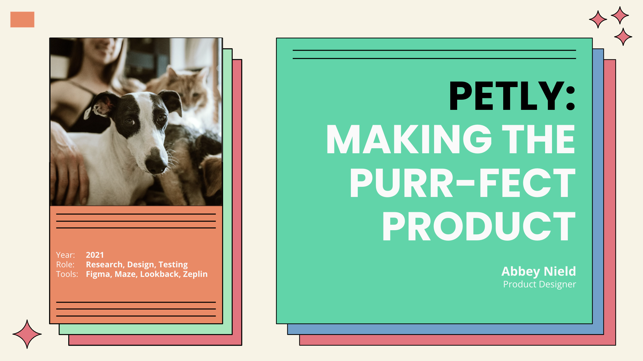
Project OvervIew
As a personal project, drawing upon my experience as a pet parent, I created the Petly App — for more efficient pet healthcare management. After speaking with many other pet parents the product idea was quickly validated. If you’re short on time, jump to the prototype below, if not — stick around and read all about it!
Challenge
How might we provide more relevant tools for pet parents so they can experience less frustration and more efficient management of their pet’s health?
With the recent rise in responsible pet parenting (insurance, food quality, daycare, sensory toys, and health treats), our team is interested in creating a product for digitally-savvy pet parents to manage their pet’s health and vet care in one place.
The pet industry is booming and pet parents are more attentive than ever. Market research shows 67% of U.S. households, or about 85 million families, own a pet as of 2020. A number expected to grow as nearly 1 in 3 Americans adopted a pet during the pandemic alone.


Research
I wanted to explore how pet parents currently manage and maintain their pet’s health as well as how they may use digital tools to plan other aspects of their lives. The goal was to determine what opportunities and needs might exist for pet health management products.
I recruited 7 participants based on a screener survey filtering for adults who use digital products and require veterinary services for one or more pets.
I then conducted 30-minute semi-structured video interviews to gather in-depth qualitative data and a 10-question online survey.
Analysis
Based on initial research, two key findings were uncovered.
Key Finding #1
Lots of services require access to pet records
Pet schedules are complicated and all participants often find the current process of accessing and sharing records cumbersome and time-consuming.
Key Finding #2
Active interaction opportunities & transparency are important to differentiate the product.
Current products are not robust enough to justify using them, and the lack of one centralized location leads to anxiety, stress, and last-minute scrambles.

Research Synthesis
I conducted an interview synthesis to uncover themes and opportunities based on what was heard from respondents — both in person and through surveys.

Concepts, Sketching & Prototyping
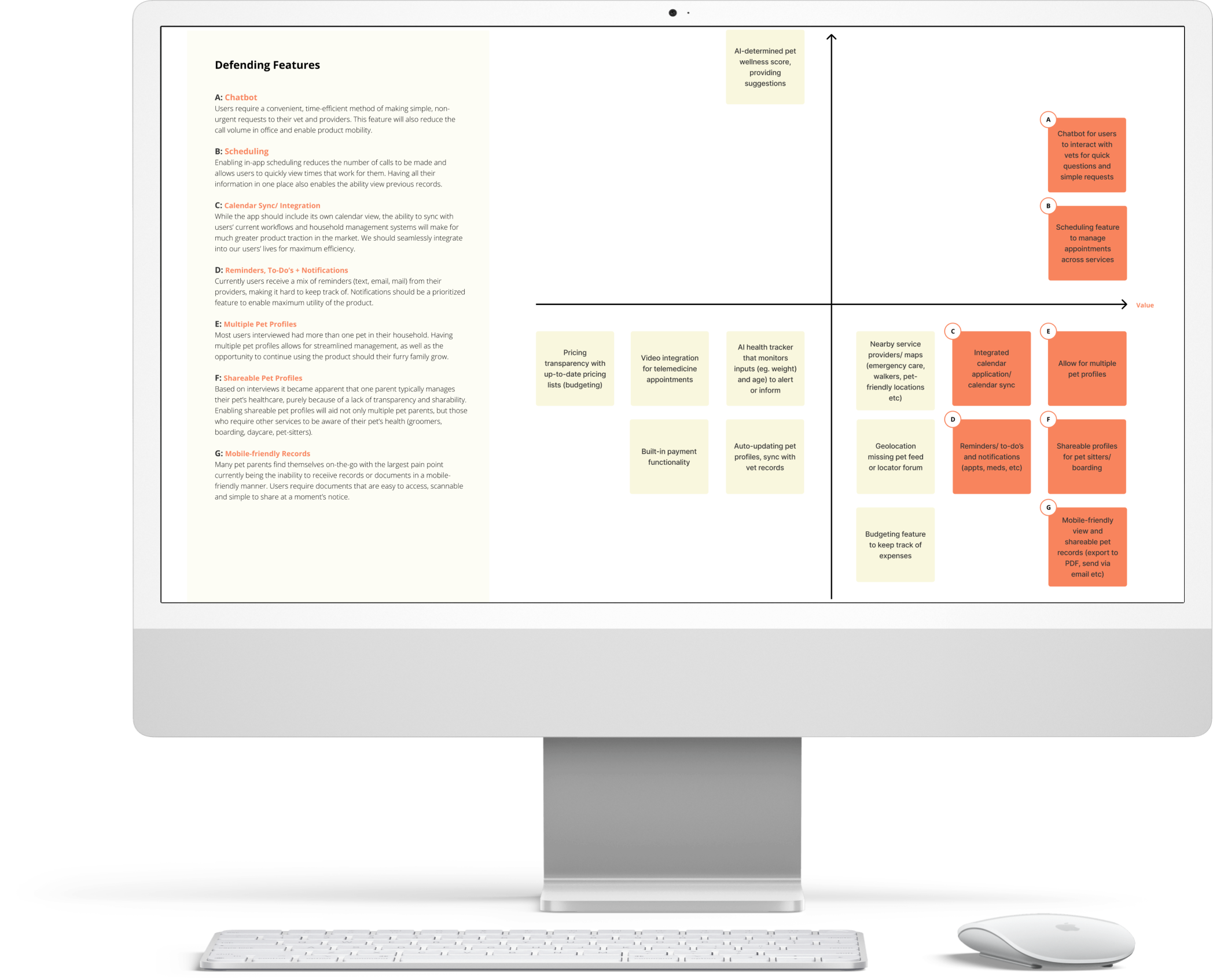
After synthesizing all the qualitative and quantitative data, I was able to begin ideating a feature list relevant to our target audience.
Knowing that all features would not be possible for the MVP phase of the project, I then plotted each feature onto a value vs complexity quadrant to help align on feature prioritization. This yielded 7 must-have features for release.
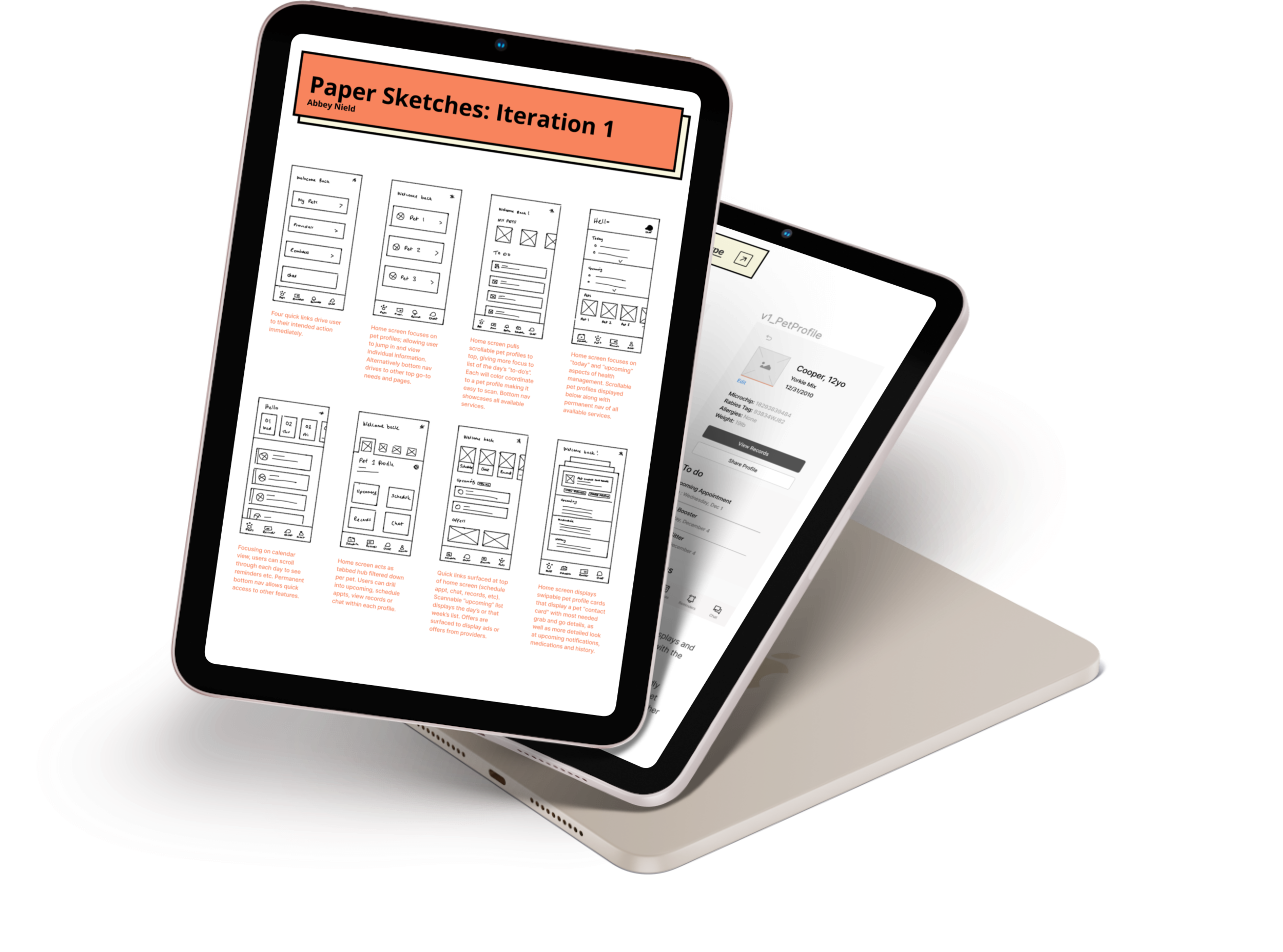
Based on the list of defended features, I jumped into prototype sketching, initially focusing on the home page with a quick crazy-8’s design exercise.
Once a direction was selected, I created a low-fidelity prototype to start testing out usability and predicted user flows.
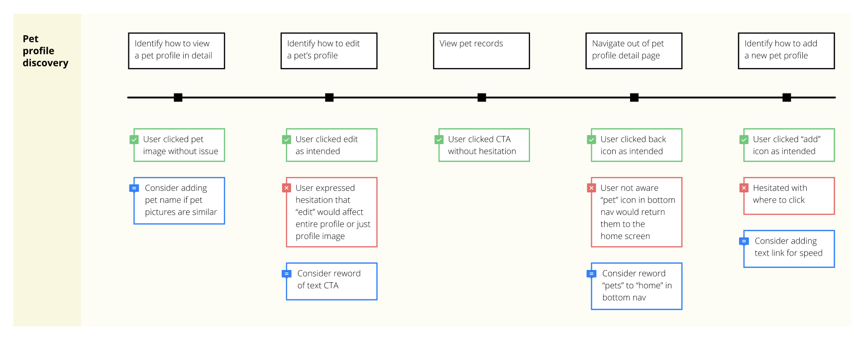
Low-Fi Design Test
Using in-person recorded sessions I tested the initial prototype with a usability study consisting of three main tasks:
Pet Profile Discovery
To-Do List Functionality
Bottom Navigation Function
From the tests, I identified the need for specific interaction abilities to be included in user onboarding, some tweaks to CTA copy, and the need for additional text link CTAs. These adjustments were noted and documented going into the final design.


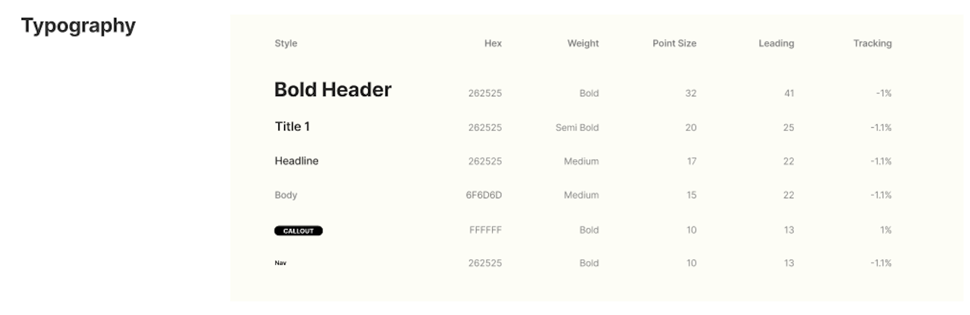
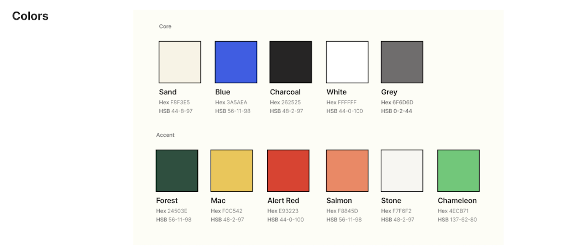
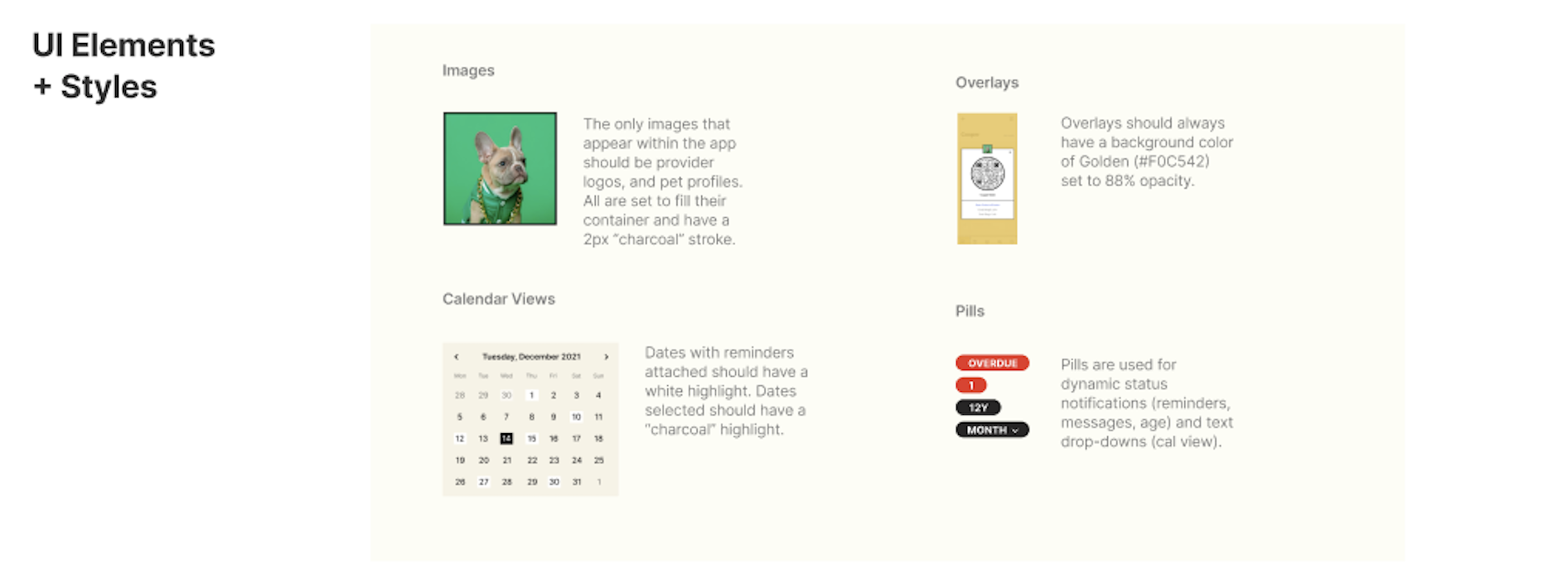
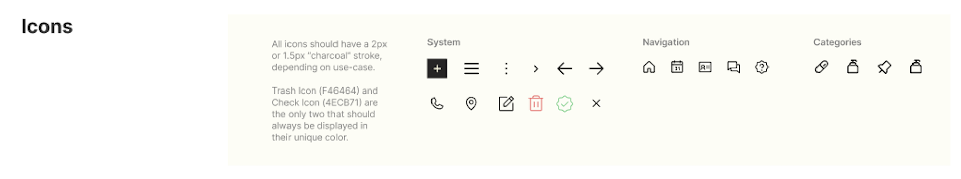
Design System
Given this was a new product and company, moving into high fidelity designs meant locking on brand styles and guidelines in order to create a cohesive design system. All were developed and translated into the first hi-fi prototype, ready for another round of user testing.
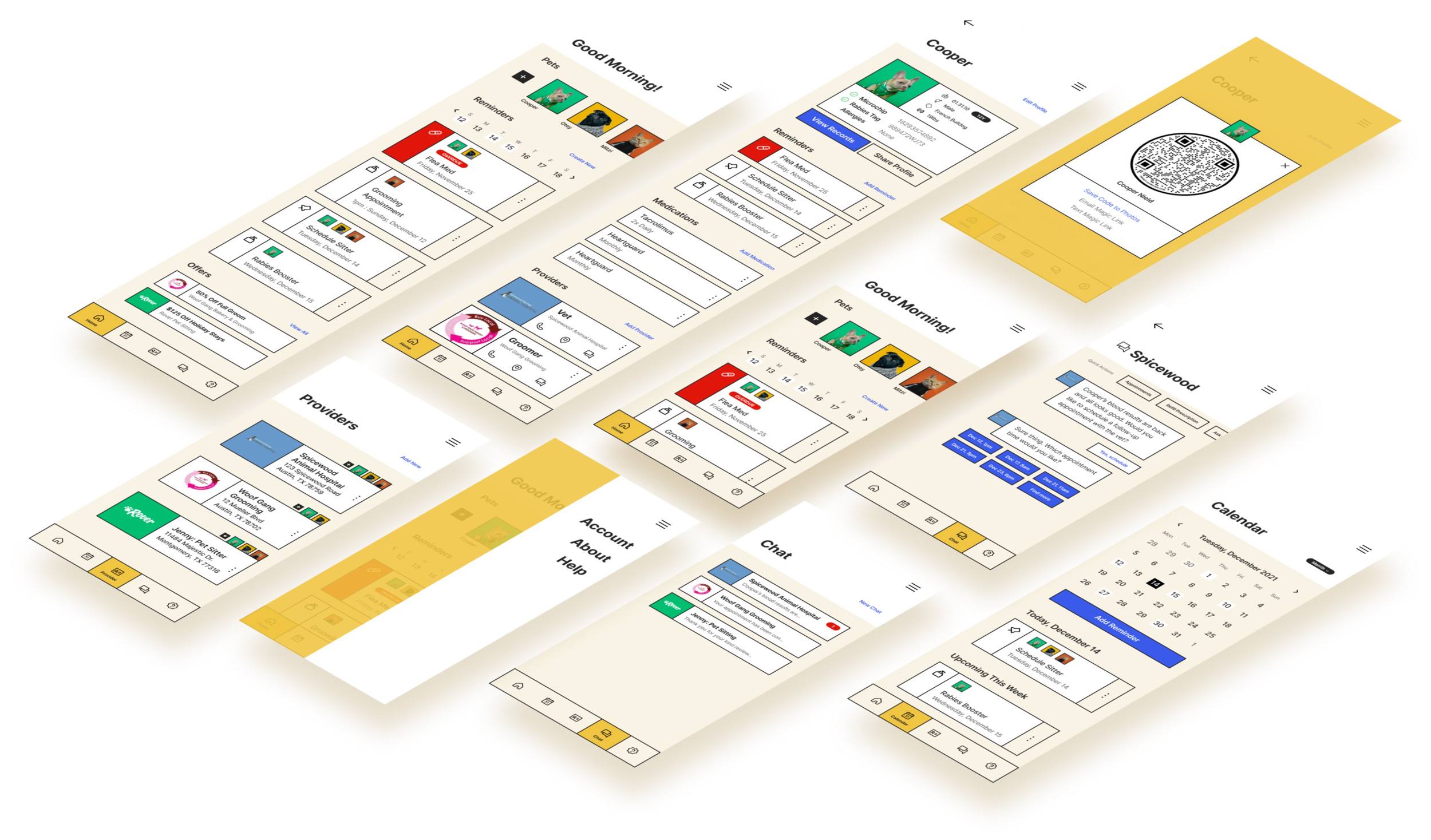
High Fidelity Design
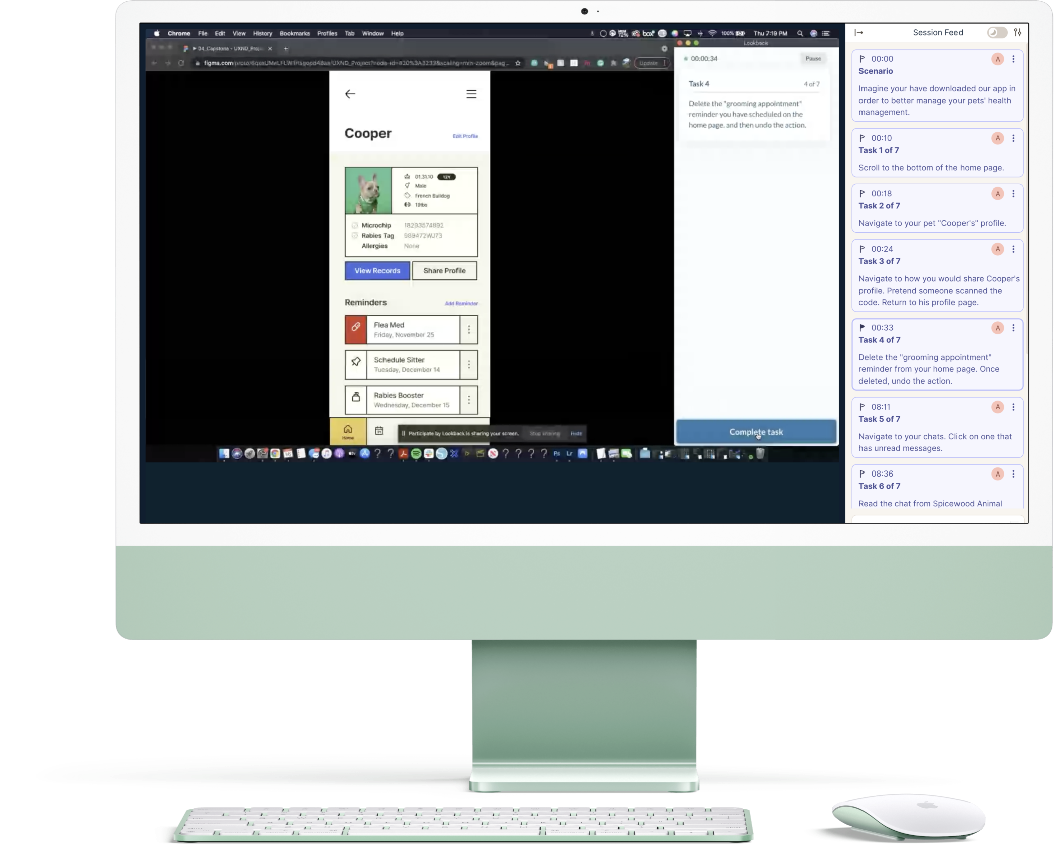
Lookback Testing, insights & solutions
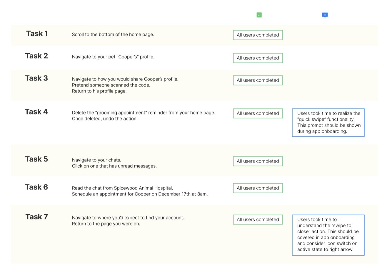
Using Lookback, recorded user tests were conducted with 10 participants. Each respondent was given 7 tasks to complete within the app on their own device.
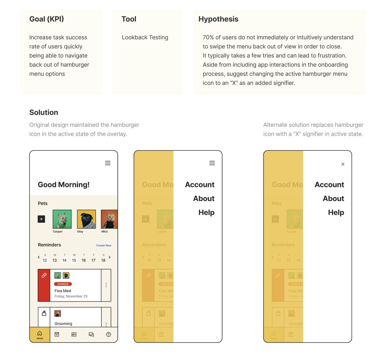
User tests further confirmed the need for “swipe gestures” to be part of the app onboarding experience, and also uncovered confusion around the functionality of the hamburger drawer — specifically how to close.
Based on the test insights, solutions and updates were implemented into the final design.

Final Design & Prototype
The final design and prototype were met with excitement and enthusiasm by respondents. There are still many features on the docket for further releases, but in relation to in-market competitors, the product is differentiated by not only looks but functionality and ease of use.