
Project Overview
As part of my Interaction Design Course with DesignLab, I received a project prompt to “design a kick-butt grocery shopping product for Good Market”. Below you will see how from defining goals and conducting research through to final design and prototyping, I brought Good Market into the digital space.
If you don’t have time to go through the condensed look at a month’s worth of work below, check out the test flow prototype here!
Business + customer goals
After receiving materials based on user personas, the intended target audience, and background on Good Market, the first step was to define and align on both the business and customer goals to determine where motivations and pain points intersect. This would in turn help guide priorities and help determine product success.

Competitive Analysis
To better understand the market and products customers had grown accustomed to with other services, I conducted a competitive analysis of three main rival brands:
Instacart
FreshDirect
Good Eggs
The focus of the analysis was to determine strengths, weaknesses, and visual design + tone in order to learn from others’ shortcomings as well as find a space that Good Market could be a clear differentiator and superior product in the space.

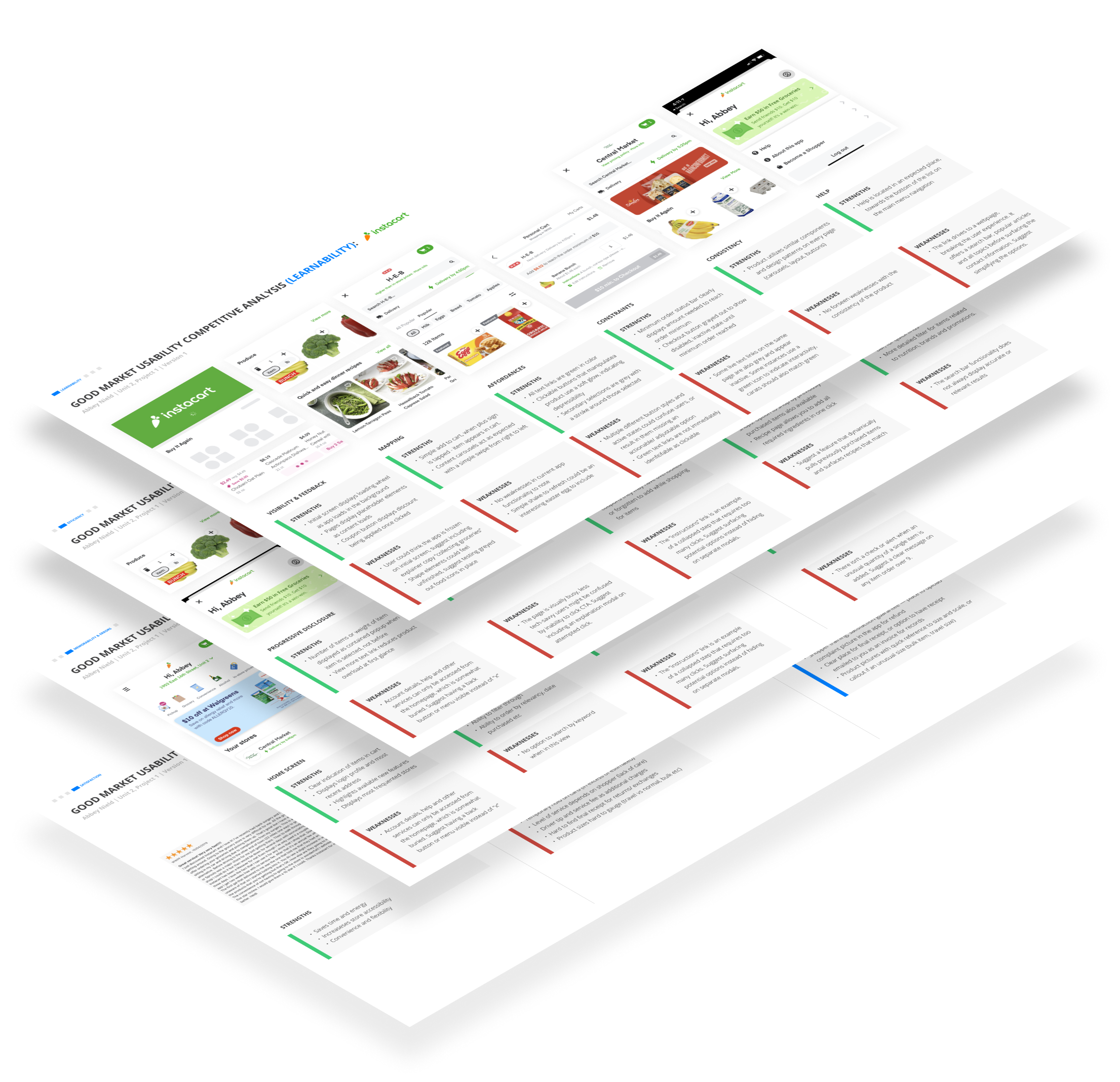
Usability competitive analysis
After analyzing the broader aspects of each competitor’s product, I then took the research further by looking at their usability performance within four main pillars:
Learnability
visibility, feedback, mapping, affordances, constraints, consistency, help
Efficiency
progressive disclosure, concise error messaging, collapsed + combined states, flexibility, ease of use
Memorability + Errors
Satisfaction
This helped determine a list of must-haves for the product, as well as highlighting potential pitfalls to watch out for in the site structure and features to make the product stand out and work without user frustration.
Information Architecture: Card Sorting Exercise
Before jumping into site maps, it was important to understand how the target audience would best interpret items and categories in order to deliver the most efficient and easily understood product. Working in FigJam, participants were given a random assortment of the 20 Good Market inventory items and asked to sort into categories relating to a grocery store environment. Participants struggled with over-complicating the categories, wanting to add broader headers with sub-categories. I believe this is due to the comfortability of the target with applications and digital products. Categories that appeared across all participants included: meat, pantry, produce, and beverages.

SITE MAP + User flow
Based on the card sorting exercise and previous research, I created an initial site map and user flow to inform UI product requirements that would later translate to wireframes.
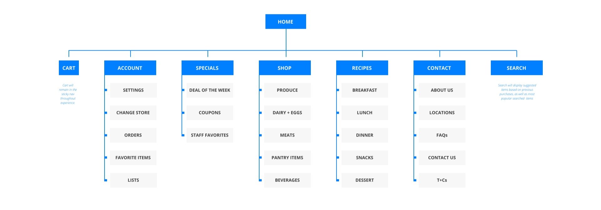
The user flow focused on a specific single user journey, highlighting navigation, key user actions, and decision points along the way. This user flow was the basis for creating the initial round of wireframes and prototype.

Annotated Wireframes
Based on the selected user flow, I designed an initial set of wireframes along with annotations.
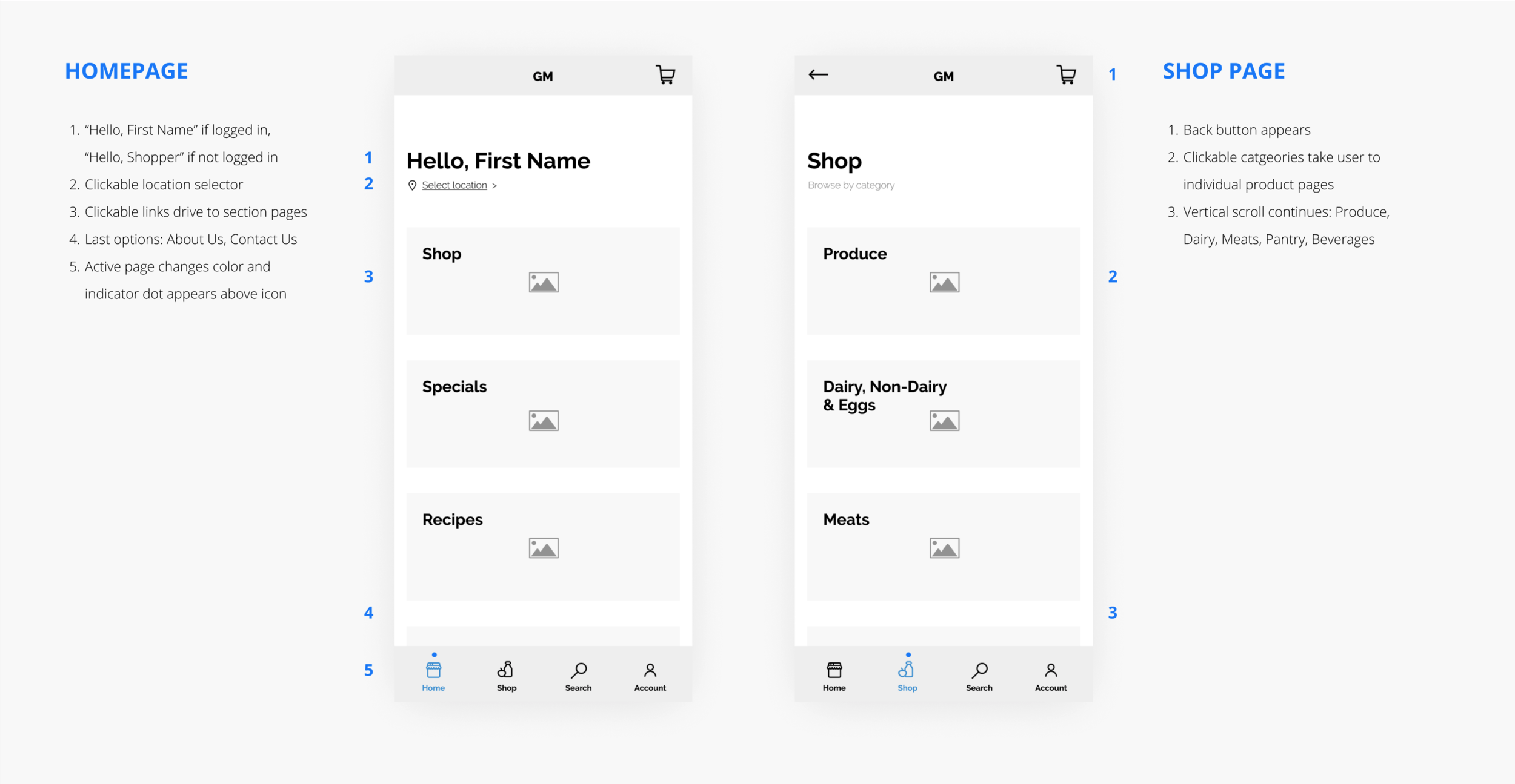
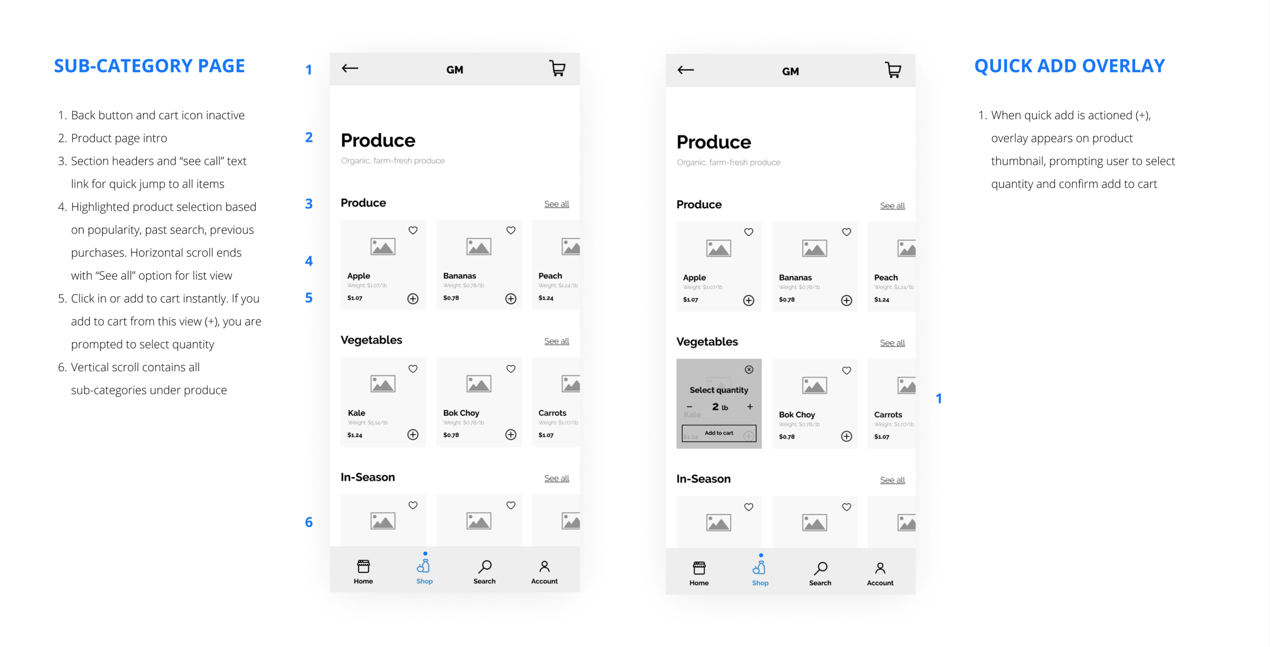
wireframe sitemap + User flow
Wireframes were then translated into a wireframe site map, a resource to visually translate screen interplay during handoff.

Design: Styles
Along with creating a simple wordmark for the Good Market store and product icon, I created a style guide consisting of typography, colors, illustration, photography, iconography and some basic components to help guide consistency during the high fidelity design process.

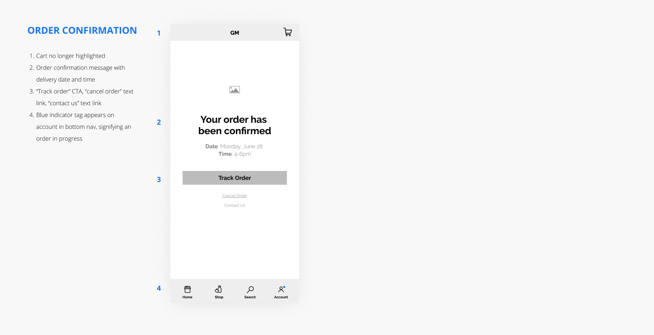
High Fidelity Design + Prototype

While in the real world there are many more screens to be built, the final user test prototype allowed for a clear run through of the most important user task the product was expected to perform — ordering groceries. Ensuring this process was simple and intuitive was a key goal for the project, as well as a design that was ownable by Good Market.
